
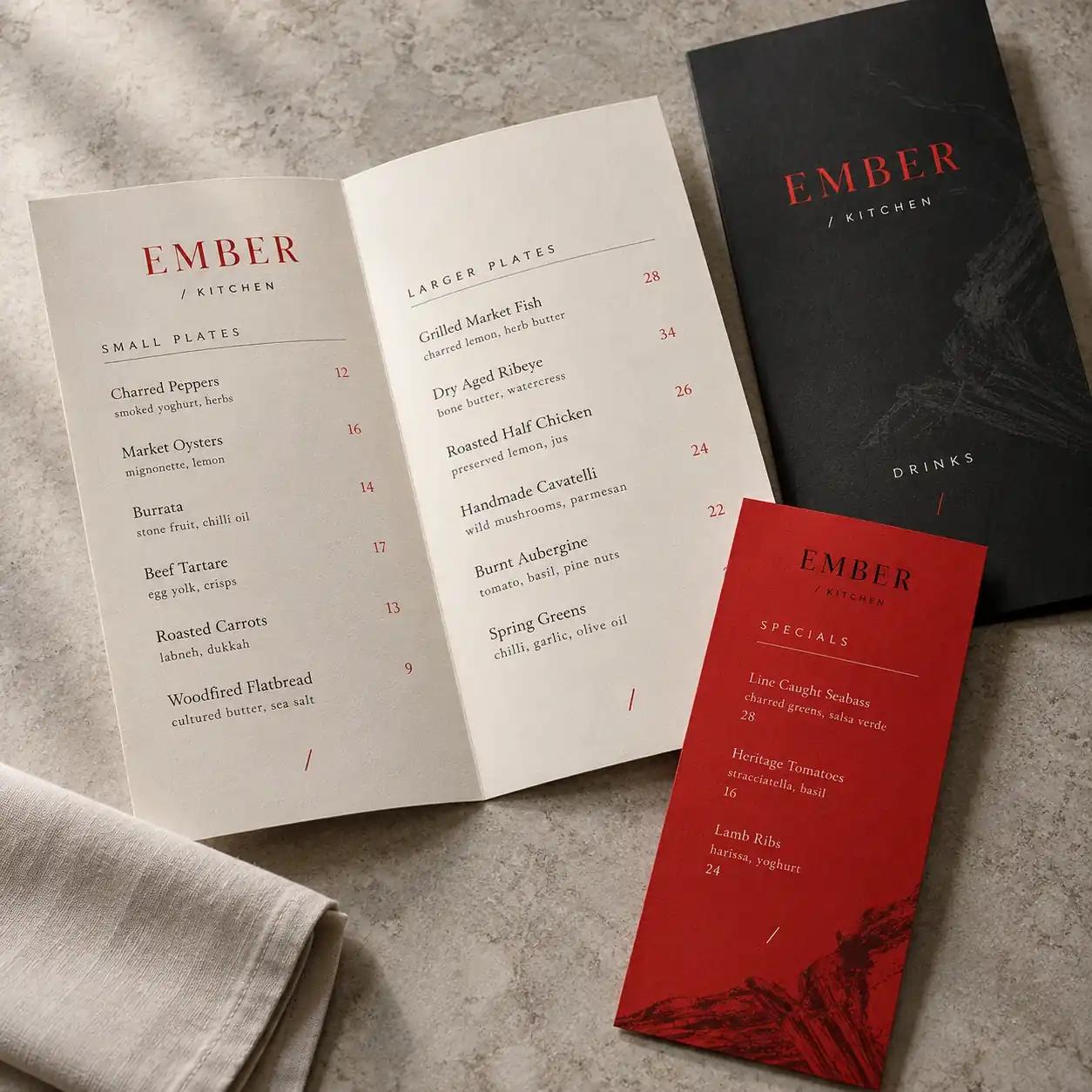
Give the food a clear hierarchy
Separate categories, dish names, descriptions and prices. A reader should be able to scan the menu without guessing which information belongs together. Keep the type comfortably readable at the final printed size.
Keep the descriptions useful
Use descriptions to explain the dish, not to fill space. Short lines and consistent spacing help the menu feel organized. Review the longest names and descriptions before approving the layout, since they often reveal the weak spots.
Think about the setting
A takeaway menu, a dinner menu and a drinks list are handled differently. Consider the table space, lighting, frequency of changes and how staff will present it. These details can guide the format and material discussion.
Print a size check
Review the layout at its intended physical size before final production. Check contrast, prices, spacing and the way folds affect the reading order. A beautiful screen preview still needs a practical print review.