
Start with the paper
Before choosing a special finish, think about the card itself. The weight, flexibility and surface change the first impression. A thick card can feel substantial; an uncoated surface can feel quieter and more natural. Neither replaces a clear layout and readable contact details.
Let a painted edge do one simple thing
An edge color adds a small flash of color when the card is held or stacked. It works best when it connects to a color already used in the identity. Keep the front and back focused so the edge can remain a deliberate detail.
Use raised spot UV with restraint
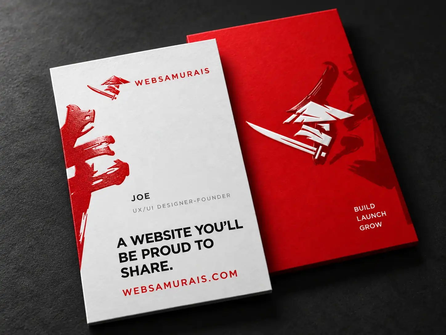
Raised spot UV introduces a glossy, tactile area over selected artwork. A logo, a pattern or a single graphic element can catch the light against a matte surface. Tiny details and closely spaced shapes need a production review, so keep the editable artwork available.
Choose the finish with the design
A soft-touch finish changes the overall feel rather than highlighting one area. Foil creates a different kind of contrast. Decide what the card should communicate, then review the stock, artwork and finishing together. The final combination needs confirmation before production.